
A visually polished page can still be a poor lead-generation asset. The median landing page converts 6.6% across industries, based on 41,000 landing pages, 464 million pageviews, and more than 57 million conversions in the benchmark summarized by involve.me's landing page statistics. That's why the strongest lead generation landing pages examples aren't just attractive galleries. They align one audience, one offer, one conversion goal, and one follow-up path.
This list evaluates seven resources as strategic models. The useful questions are practical: Is the offer clear? Does the message match the traffic source? Is the form asking for too much? Does the page earn trust near the CTA? Does the mobile experience stay focused? What happens after submission? The resources range from broad example galleries and builder guides to CRO teardowns, email-focused funnels, and an end-to-end agency model relevant to local and regional service businesses. For teams that want to test usability before launch, try Uxia for landing page testing.
Table of Contents
- 1. Queen City Digital
- 2. Unbounce
- 3. HubSpot
- 4. Leadpages
- 5. GetResponse
- 6. Mailchimp
- 7. CXL
- Lead Gen Landing Pages, 7-Platform Comparison
- Turn Inspiration Into Your Next Conversion Test
1. Queen City Digital
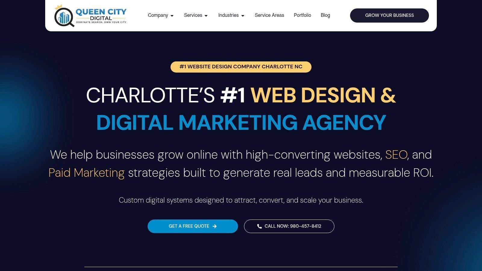
Queen City Digital is the most operationally complete model in this group because it treats a landing page as part of a lead-generation system, not as an isolated design project. The Charlotte, North Carolina agency combines conversion-focused, mobile-first websites with local SEO, Google Ads, paid social, content, reputation management, analytics, and ongoing optimization. For a home-service contractor, medical practice, professional firm, restaurant, or regional B2B company, that connection matters. A page has to receive relevant traffic, capture the inquiry, and make the next sales action visible.
The local specialization is a meaningful differentiator. Queen City Digital builds campaigns around Charlotte and the Carolinas, including neighborhood-level search intent and Google Business Profile optimization. That gives a local service page more context than a generic national template. A roofing page targeting one service area shouldn't make visitors wonder whether the business serves their neighborhood, responds locally, or understands the job they need.
Why the model works for service businesses
The offer structure is built around measurable business outcomes, such as inquiries, bookings, calls, or qualified consultations. The agency also emphasizes transparent KPI reporting, continuous testing, and integrated execution, which reduces the gaps that appear when one vendor builds the page, another runs ads, and nobody owns the full conversion path.
Its documented proof includes examples such as increased bookings for a salon and full enrollment capacity for a private school. Those examples are more useful than decorative testimonials because they connect marketing activity to the outcomes local operators care about. Queen City Digital also reports completing more than 200 projects and lists client retention at approximately 90%, details provided in its business brief.
The trade-off is fit. The agency's strongest expertise is regional, particularly Charlotte and the Carolinas, so a national brand may need a different partner. Its recurring packages begin at $1,497 per month, and the highest-tier guarantees apply only to premium plans. For a very early-stage business, that investment requires a clear lead value and tracking plan.
Practical rule: A landing page isn't finished when the form works. It's finished when the business can trace the lead from source to sales outcome.
2. Unbounce
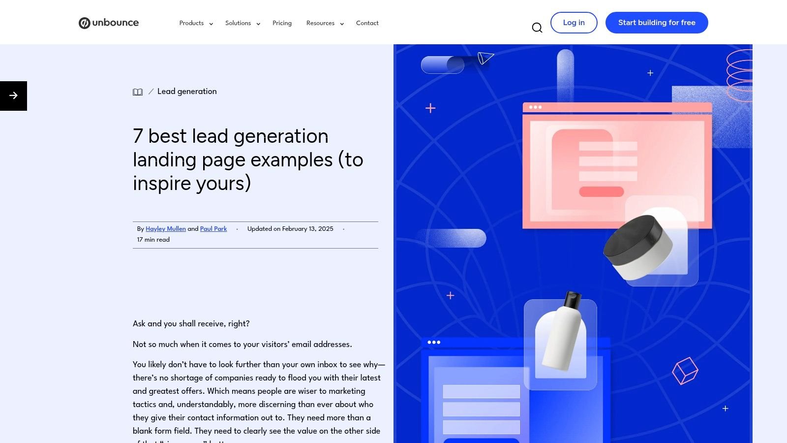
Unbounce's lead-generation landing page examples are most useful when you want to move from inspiration to a testable wireframe. The resource presents customer pages with commentary around offers, forms, trust cues, layout, and conversion mechanics. Instead of asking readers to admire a hero section, it encourages them to identify the reason a visitor should act.
That makes the gallery useful across several offer types, including downloadable content, demos, and waitlists. A local agency could adapt the same logic for a service-area consultation, a seasonal inspection offer, or a regional buyer's guide. The page should carry the promise from the ad into the headline, explain the benefit before the form, and repeat the same CTA only when the visitor has received enough information to decide.
The main limitation is platform bias. Many examples are built with Unbounce, so the layouts may reflect that ecosystem more than the full range of technically possible landing pages. The examples also don't consistently include performance data, which means the page should be treated as a hypothesis library rather than proof that a particular visual pattern will work.
What to borrow
- Annotated critique: Translate each observation into a wireframe decision, such as moving proof closer to the form or rewriting a vague CTA.
- Offer variety: Compare pages by traffic intent, not just by appearance. A demo page needs more qualification than a simple guide download.
- Campaign continuity: Carry the source ad's language into the landing page, then connect the submission to a tracked thank-you action.
Teams managing paid campaigns should also pair the page with conversion tracking in Google Ads so submissions don't disappear into an unmeasured form inbox. For rapid pre-sell experiments, create pre-sell landing pages fast before committing a broader campaign budget.
3. HubSpot
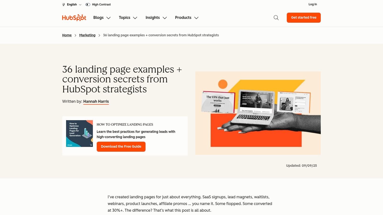
HubSpot's landing page example collection works as a broad benchmarking library. It covers multiple page types and includes a dedicated lead magnet section, so readers can compare how a downloadable guide, webinar, demo, or other offer changes the page's copy and form strategy.
Its strength is range. A marketer can inspect a headline that frames the value exchange, a form that asks for only necessary information, or a proof block that addresses hesitation before the CTA. That makes it a good starting point when a team knows it needs a landing page but hasn't decided whether the visitor should download, register, request, or book.
The weakness is equally clear. A broad gallery can encourage surface-level copying. A polished B2B page may not translate to a Charlotte plumbing company, and a national software demo page may require more trust and qualification than a local consultation page. Example links and screenshots can also change, so teams should extract the underlying decision rather than duplicate the visual treatment.
How to adapt the gallery
Start with the audience and traffic source. Then select the offer that best matches the visitor's intent. For a professional service firm, the page might offer a consultation or a practical guide. For a regional industrial company, it might ask for a technical assessment. The hero should state who the offer serves and what the visitor receives.
A page also needs a post-conversion plan. The thank-you page can deliver the resource, confirm the next step, and route the lead into the correct sales or nurture workflow. That broader connection is the subject of this full-funnel marketing strategy, where the landing page functions as one stage in the customer journey rather than the entire strategy.
4. Leadpages
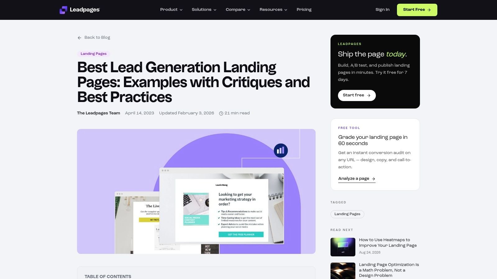
Leadpages' lead-generation examples are designed for practitioners who want to build quickly. The resource organizes examples by use case, including lead magnets, webinars, and PPC campaigns, then adds commentary about what to copy or change. Its downloadable lookbook contains more than 30 real pages, according to the supplied resource description, giving teams a practical reference set rather than a handful of isolated screenshots.
The use-case organization is the most valuable feature. A webinar registration page has to make the topic, timing, speakers, and attendance benefit obvious. A paid-search page needs tighter message match and a stronger connection between keyword, ad, and offer. A downloadable guide can usually keep the qualification lighter because the immediate exchange is simpler.
The builder orientation speeds implementation, but it also creates a constraint. Many examples are tied to Leadpages, and the performance commentary is largely qualitative. A team shouldn't assume that importing a template will solve a weak offer or mismatched traffic. The template can establish hierarchy, but the business still has to supply credible proof and a clear reason to act now.
A useful replication process
Take one page from the collection and reduce it to five decisions:
- Audience: Who should recognize themselves immediately?
- Promise: What specific benefit does the visitor receive?
- Evidence: Which testimonial, credential, result, or explanation reduces risk?
- Form: What information is needed for follow-up?
- Continuity: What happens after the visitor submits?
That process reflects the principles of conversion-focused web design. It also prevents a common mistake, treating a template's spacing and colors as the conversion strategy.
5. GetResponse
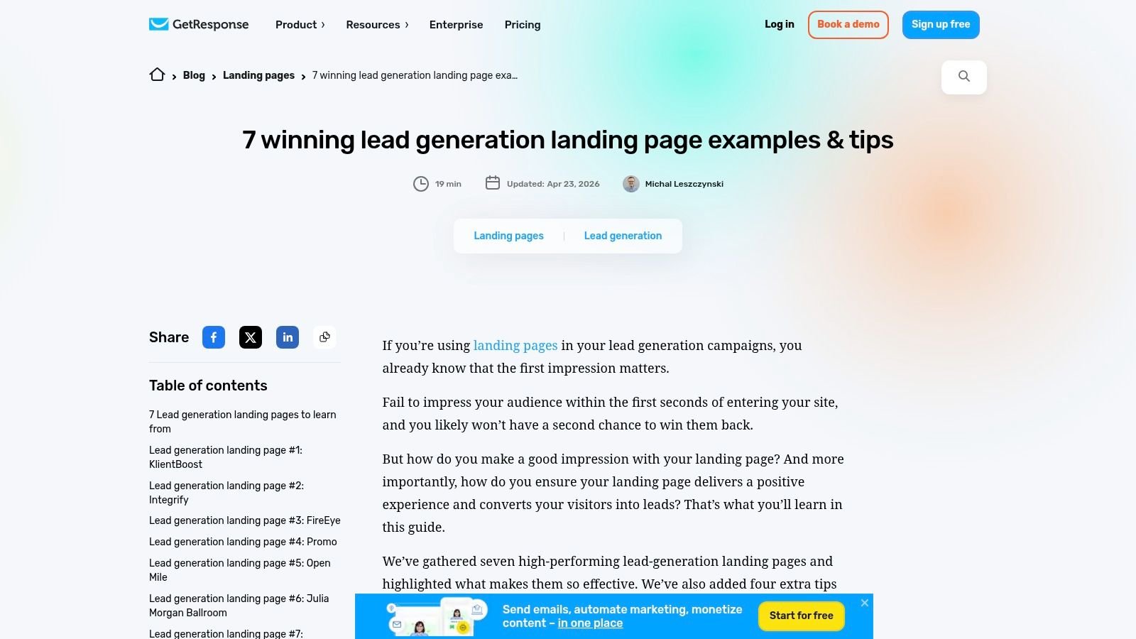
GetResponse's lead-generation landing page guide takes a narrower, more mechanical approach. Rather than presenting the broadest gallery, it focuses on form length, one-field forms, exit-intent behavior, and the continuity between the landing page and the rest of the funnel. That makes it useful for teams that already have an offer but suspect the capture experience is creating unnecessary resistance.
The one-field example is especially relevant for newsletter growth, gated content, and early-stage interest capture. It keeps the initial commitment small, then lets the follow-up sequence gather context over time. That isn't automatically right for every service business. A contractor may need a service type and location to route an inquiry, while a medical practice may need a scheduling path rather than a generic email opt-in.
Where it fits
GetResponse is a practical choice for a creator, consultant, or SMB that wants to connect a page directly to email automation. The guide also points readers toward a template library containing more than 200 templates, as described in the supplied plan notes. That gives teams a quick starting point for newsletters, gated resources, and nurture funnels.
The trade-off is ecosystem dependence. Some recommendations naturally point toward GetResponse features, so marketers using a different CRM or form platform will need to translate the implementation. The guide also includes fewer examples than a large roundup, which limits comparison across industries.
Use its lessons to separate capture from qualification. Ask for the minimum information needed at the first step, then use the thank-you page, email sequence, or later conversation to learn more. For higher-intent local leads, a multi-step form can preserve a simple opening while collecting service details before the sales team responds.
6. Mailchimp
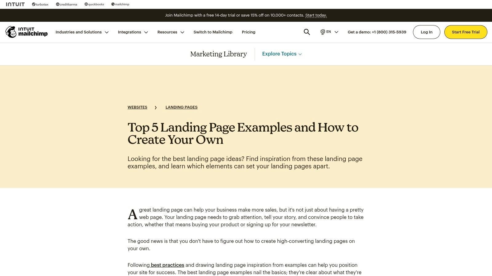
Mailchimp's landing page examples are aimed at the first-time builder. The collection uses a small set of examples to explain the fundamentals, including a clear value exchange, a focused form, trust signals, and basic analytics setup. That simplicity is a strength for an SMB that needs a credible starting point without a large CRO process.
The resource is particularly useful for list growth. A restaurant might offer updates or a booking incentive, a local retailer might promote a seasonal event, and a professional firm might deliver a guide in exchange for an email address. In each case, the visitor should understand the benefit before deciding whether the business deserves permission to follow up.
Mailchimp also connects the page to its own builder and analytics tools. That helps a beginner move from concept to implementation, but it reduces cross-platform variety. Advanced teams may find the collection too light for complex qualification, paid-search segmentation, or multi-stage sales processes. It contains only five examples, according to the supplied plan notes, so it works better as a fundamentals primer than as an extensive research library.
The beginner's strongest lesson
Don't confuse a short page with a complete page. Even a compact local offer needs a recognizable benefit, a reason to trust the business, a clear CTA, and a confirmation experience that tells the lead what happens next. If the follow-up is email-based, Mailchimp email marketing services can be part of a broader lifecycle system rather than an afterthought.
The page should also connect submission data to a real business action. A new subscriber may need a welcome sequence, while a consultation request may need an immediate notification and sales assignment. The right setup depends on the offer, but the principle stays the same: capture only information the team will use.
7. CXL
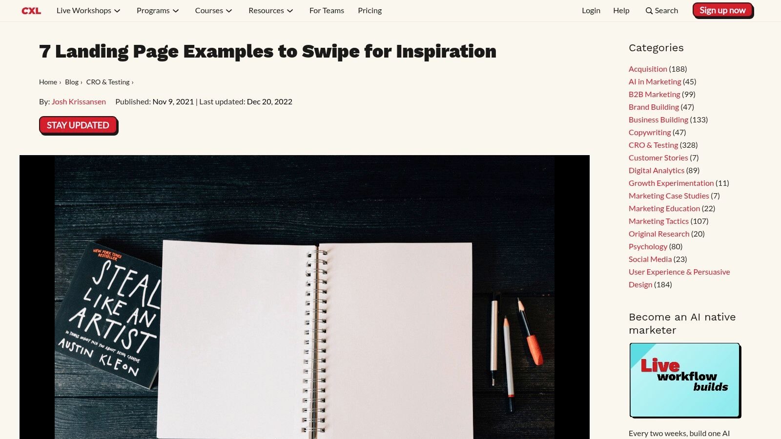
CXL's landing page examples are less about collecting a large swipe file and more about developing a conversion-optimization habit. Its practitioner-oriented teardowns examine messaging hierarchy, above-the-fold clarity, risk reversal, proof, and friction. The value is in the questions each critique creates: What does the visitor understand first? What objection remains unanswered? Which element should a team test rather than debate?
That approach is useful when a page already receives traffic but produces inconsistent lead quality. Instead of immediately shortening the form or changing the button color, a team can test whether the offer matches the audience, whether the headline reflects the ad, and whether proof appears close enough to the decision point.
Turning critique into experiments
For a local service business, the CXL method can produce focused hypotheses:
- Message hierarchy: Does the first screen name the service, location, and outcome clearly?
- Risk reduction: Does the page explain response timing, privacy, pricing context, or what the consultation includes?
- Proof placement: Does a relevant review or credential appear near the form instead of being buried below unrelated content?
- Funnel continuity: Does the thank-you page confirm the request and prepare the visitor for the next contact?
The limitation is scale and localization. CXL offers fewer examples than broad collections such as HubSpot, and its pages aren't built specifically for Charlotte or regional service markets. Teams must adapt the methodology to local intent, service areas, and sales workflows.
A landing page test should answer a business question, not settle a design preference.
The measurement layer matters just as much as the experiment. Analytics and reporting support helps connect submissions to the KPIs that determine whether a page is useful, including lead quality, booked appointments, and downstream revenue rather than form volume alone.
Lead Gen Landing Pages, 7-Platform Comparison
| Item | Implementation complexity | Resource requirements | Expected outcomes | Ideal use cases | Key advantages |
|---|---|---|---|---|---|
| Queen City Digital | High, agency-led, end-to-end setup | High, monthly retainers ($1,497–$4,997+/mo); ongoing management | Predictable local leads and revenue; KPI-backed improvements (90‑day/top‑tier guarantees) | Local/regional SMBs (home services, medical, retail, regional B2B) | Local-SEO playbooks, integrated services, strong retention, clear KPI guarantees |
| Unbounce | Low–Medium, review annotated examples and adapt | Low, time to review and test; favors Unbounce stack | Actionable wireframes and page element improvements | Marketers/designers testing layouts and copy | Concrete, annotated live examples with copy/form callouts |
| HubSpot | Low, browse and apply broad best practices | Low, time investment; no platform lock-in | Wide benchmarking; headline and value-exchange guidance | Teams seeking cross‑industry inspiration and copy/layout standards | Largest single-page gallery; strategic tips; frequently updated |
| Leadpages | Low–Medium, use teardowns and templates to replicate | Medium, Leadpages subscription or template downloads | Fast replication of proven page patterns; PPC-aligned pages | Rapid-build campaigns (webinars, lead magnets, PPC) | Organized examples by use case, downloadable lookbook, ready templates |
| GetResponse | Low, focused on lead‑gen mechanics and quick builds | Low–Medium, GetResponse editor and template library | Testable mechanic improvements (forms, exit‑intent, funnel continuity) | Teams launching gated content or newsletter funnels | Mechanics-first guidance tied to builder templates (200+ templates) |
| Mailchimp | Low, beginner-friendly, guided builds | Low, Mailchimp account and basic setup time | Solid fundamentals for first lead‑gen pages; analytics setup | SMBs creating initial lead-generation pages | Concise walkthroughs, analytics/attribution tips, tool-aligned guidance |
| CXL | Medium–High, practitioner-grade teardowns and CRO planning | Medium–High, requires CRO expertise and testing capacity | Testable CRO hypotheses, improved messaging hierarchy and UX | Conversion teams focused on optimization and experiments | Methodology-driven critiques; tactical CRO and UX insights |
Turn Inspiration Into Your Next Conversion Test
The best lead generation landing pages examples are useful because they expose decisions you can test. They don't provide a universal layout. A page that works for an email-driven guide may fail for cold paid search, while a qualification-heavy consultation page may outperform a shorter form because the business needs better routing and lead quality.
Start with one audience and one traffic source. A page for Google Ads should reflect the search intent and language of the ad. A page for an email audience can assume more familiarity, but it still needs to state the value exchange quickly. The overall benchmark is 6.6% median conversion across industries, while the same source reports substantial variation by industry, including 12.3% for events and entertainment and 3.8% for SaaS. Those figures are benchmarks, not promises, so use them to frame a measurement plan rather than to copy an expected result. See the benchmark data from involve.me for the source context.
Next, make the offer explicit above the fold. Tell visitors what they receive, who it's for, and what happens after they submit. Keep the form to the information the team needs. If qualification matters, consider a progressive or multi-step flow instead of placing every question in the first view. Trust belongs near the CTA, where privacy language, reviews, credentials, service-area details, or a clear response expectation can reduce uncertainty.
Then connect the page to the rest of the funnel. Deliver the resource, confirm the request, schedule the next step, and pass source information into the CRM or reporting system. A form submission without follow-up is not a complete conversion process. It's an unworked opportunity.
Choose one high-impact hypothesis and build a focused variant. Test the headline, offer framing, CTA, form structure, or proof placement before spending time on minor visual changes. Pages with a single CTA average 13.5% conversion in the historical benchmark summarized by Blogging Wizard's landing page statistics, and the same summary notes that removing navigation has doubled conversion in some studies. Treat those findings as directional evidence, then judge your own page by qualified leads and business outcomes.
For Charlotte and regional service businesses, Queen City Digital is a relevant option when landing-page design needs to work alongside local SEO, PPC, analytics, and continuing optimization. Its integrated model keeps traffic acquisition, conversion structure, reporting, and follow-up connected instead of leaving each stage with a different vendor.
Queen City Digital builds conversion-focused websites and landing pages connected to local SEO, Google Ads, paid social, analytics, and ongoing optimization for Charlotte and regional service businesses. Visit Queen City Digital to discuss a lead-generation system built around your offer, service area, and measurable sales goals.